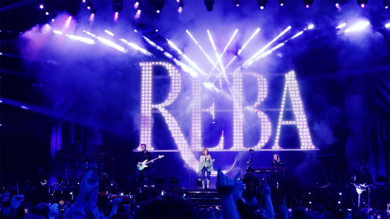
Lüz Studio lights Reba McEntire MSG show
- Details

The Montreal based design and production team, which included David Rondeau, Pierre-Luc Bedard, and LD Andy Knighton, wove a textured narrative to reflect the multi-Grammy winner’s music by using a range of different techniques, most of them centred on employing lighting and set extensions as storytelling tools.
“This show is a great music show; it is not theatrical at all, so lighting is a big actor in the narrative,” said Larivée. “We wanted to create lighting moments. There’s so much history in Reba’s lyrics, and we wanted to tell those stories visually with light. We don’t have a cinematic style of video design, so when we tell stories, it’s not through an animated video that looks like a music video. Our strategy is to do that through lighting and set extension. We strive define the single set that could evoke the feeling or the topic of each particular song.”
Set extensions were used throughout the show, such as with the Art Deco sun shaped scenic element for Walk On, a song that talks about hope. Using the virtual lighting for this number brought a luminous look to support the music.
“We also did things like create curtains, a signature Reba look, and the New York skyline for ‘Fancy,’ which is about how she started in a rundown shack and how she made it to the big city,” said Larivée. “Going with NYC footage would have been the easy way to go but customising Reba’s own skyline makes it more personal.
Key to providing the lighting element of this storytelling show were 30 Chauvet Professional Maverick MK3 Spot fixtures, supplied by Bandit Lites, which provided the aerial effects. “The Garden’s ceiling catches light so well that it created a canopy for a lot of songs,” noted Larivée. “On top of that, the great lighting director, Andy Knighton, was managing the MSG show, and he added some breakup lights to light up the audience because it was shot for TV.”
The high output (51,000 source lumens) Maverick fixtures were also critical in contributing to fluid, natural looks around the stage’s big 5 mm video wall, which measured 60ft by 24ft. Wanting to enhance the natural narrative of the show by avoiding “that big TV look” with their massive screen, the design team blended the stage with the screen, losing the bottom of the wall by merging it with light from the Maverick MK3 Spot.


